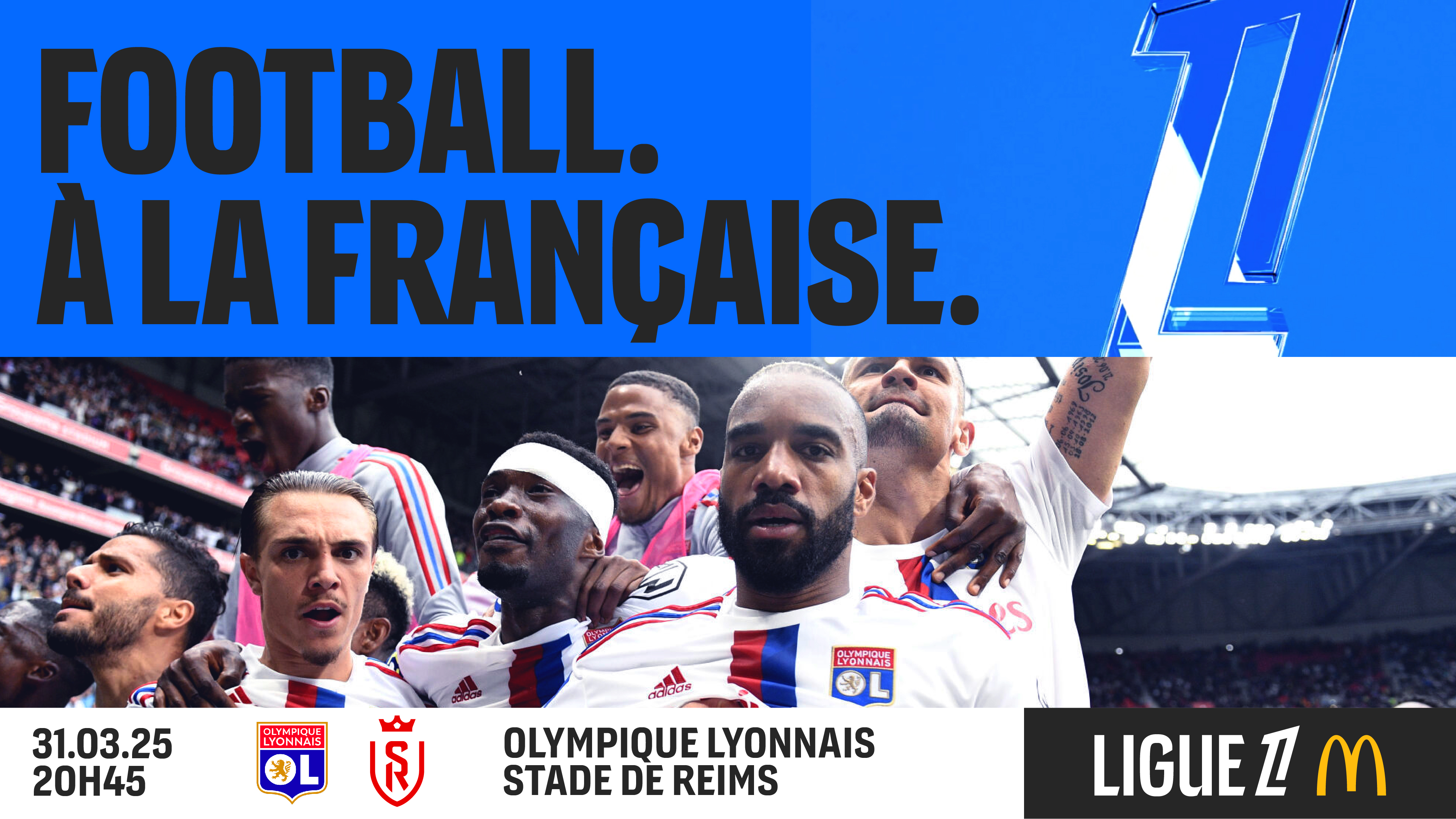
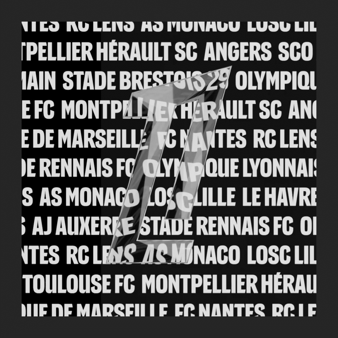
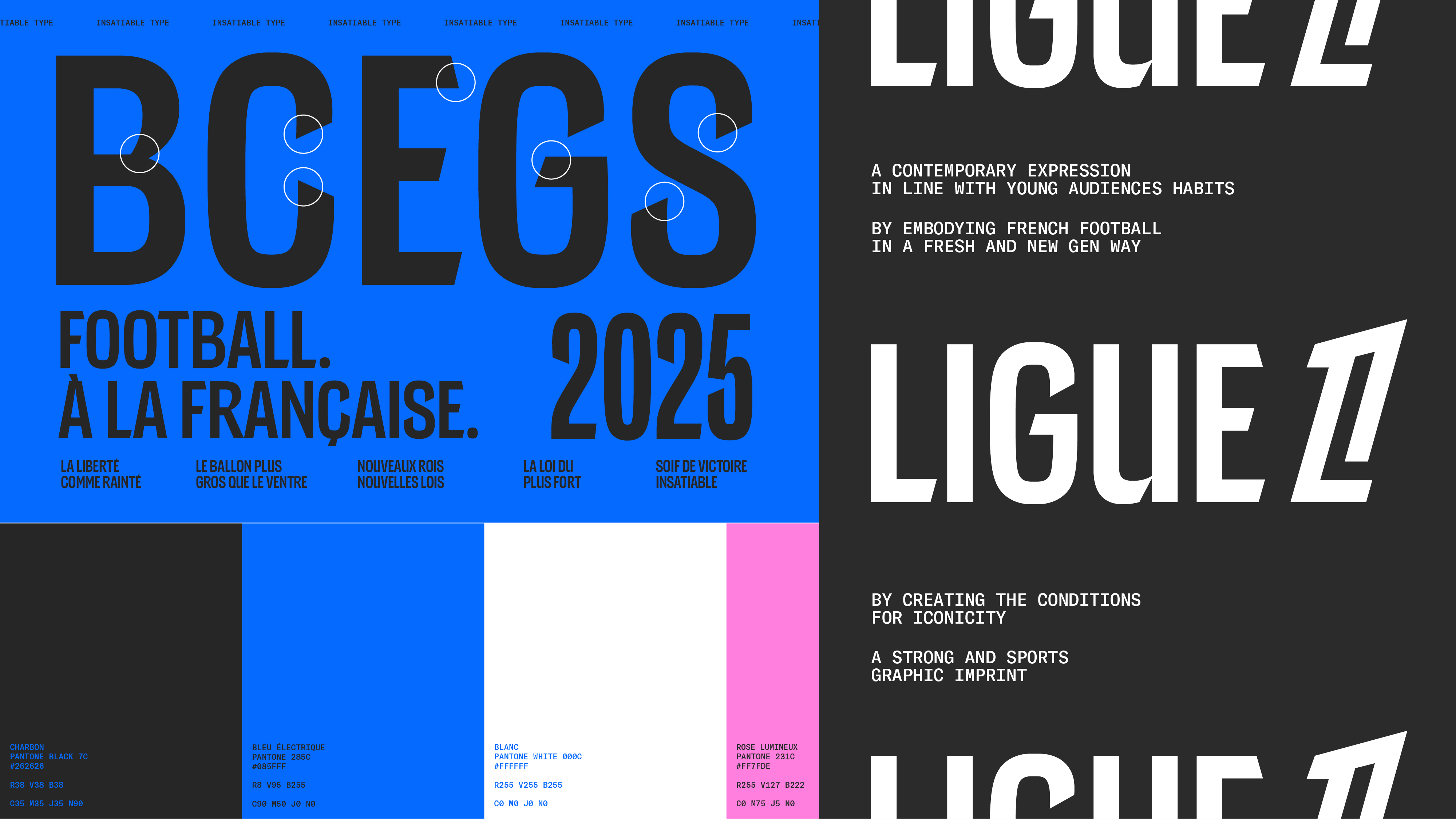
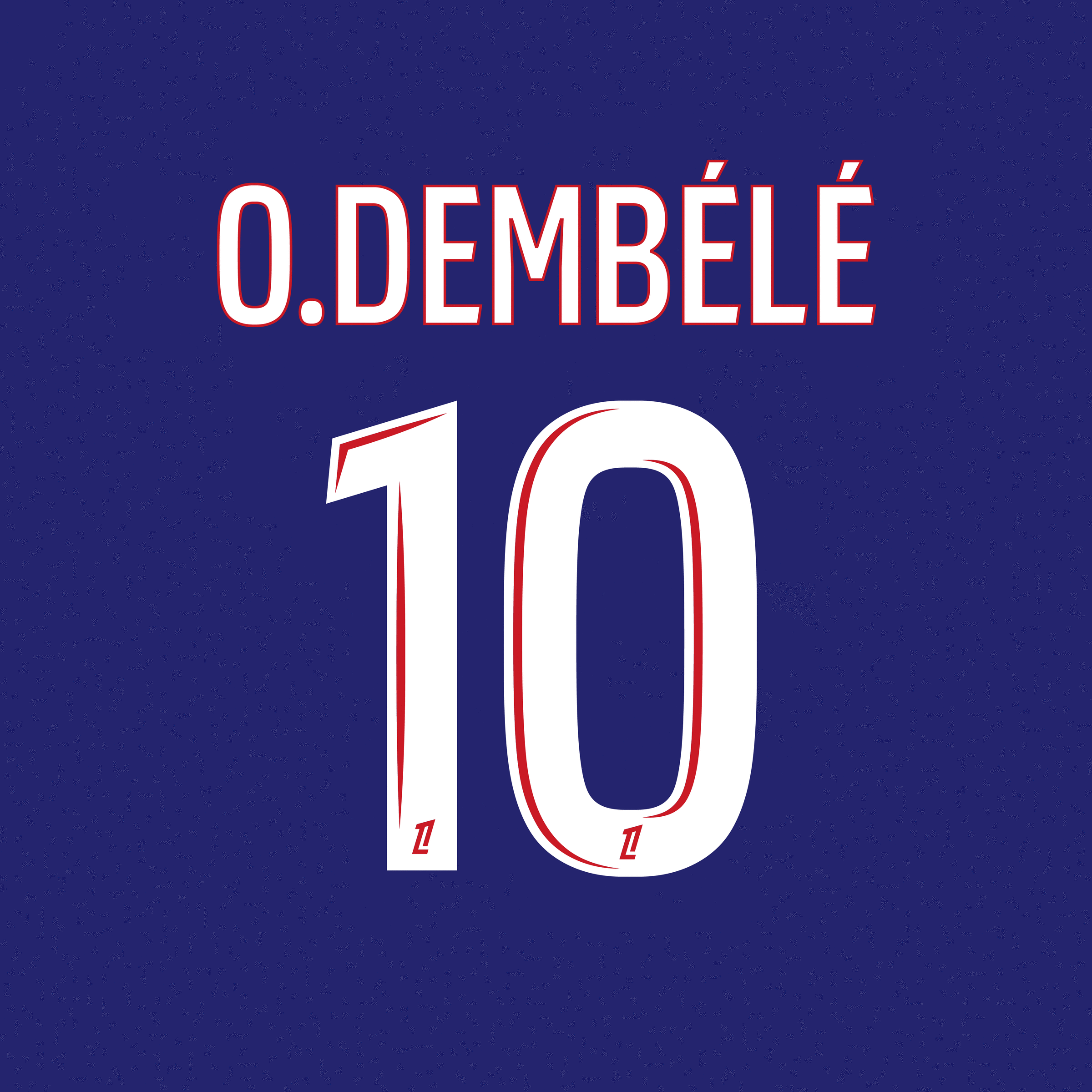
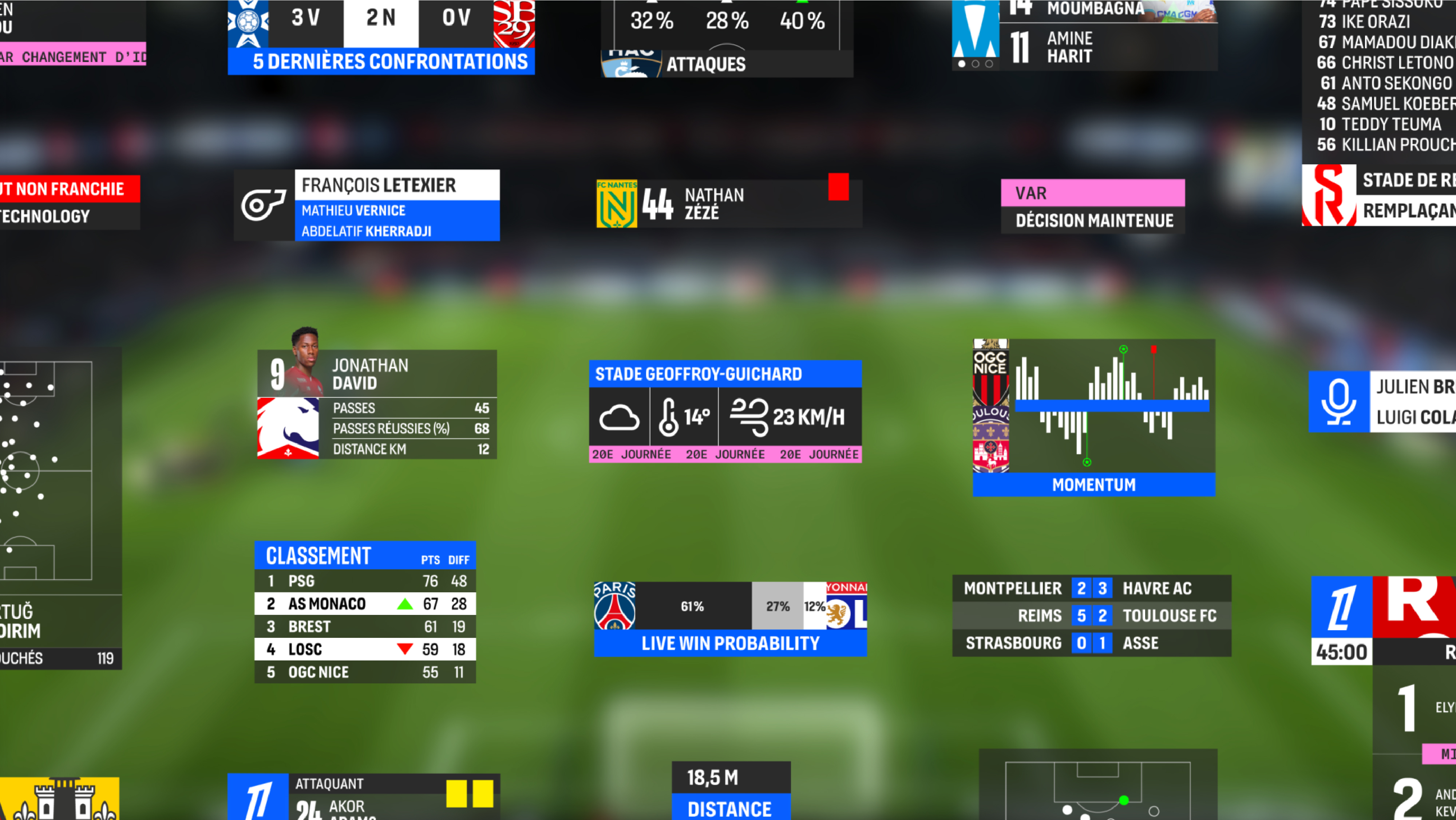
This type family consists of three distinct fonts, designed to bring a fresh, modern edge to football branding. Each font captures the unique essence of the sport in France, blending seamlessly into a dynamic and playful identity. The Display font stands out with its sharp, modular endings, adding energy and movement to the design. Carefully connected accents create compact, impactful titles that enhance readability and visual impact. The TV version builds on the same foundation but features wider shapes, open counters, and looser spacing for optimal legibility at smaller sizes—ideal for score displays, stat sheets, and in-game information. The Jersey font is a variable typeface, allowing player names to be adjusted seamlessly based on their length. It also includes bold, highly visible numbers in four customizable styles, adaptable for clubs whilst ensuring clarity and flexibility on the field.
Client: Ligue de Football Professionnel
Art direction: Leroy Tremblot
Designed with Julie Soudanne
Production with Benjamin Blaess
Case study: Leroy Tremblot
Art direction: Leroy Tremblot
Designed with Julie Soudanne
Production with Benjamin Blaess
Case study: Leroy Tremblot