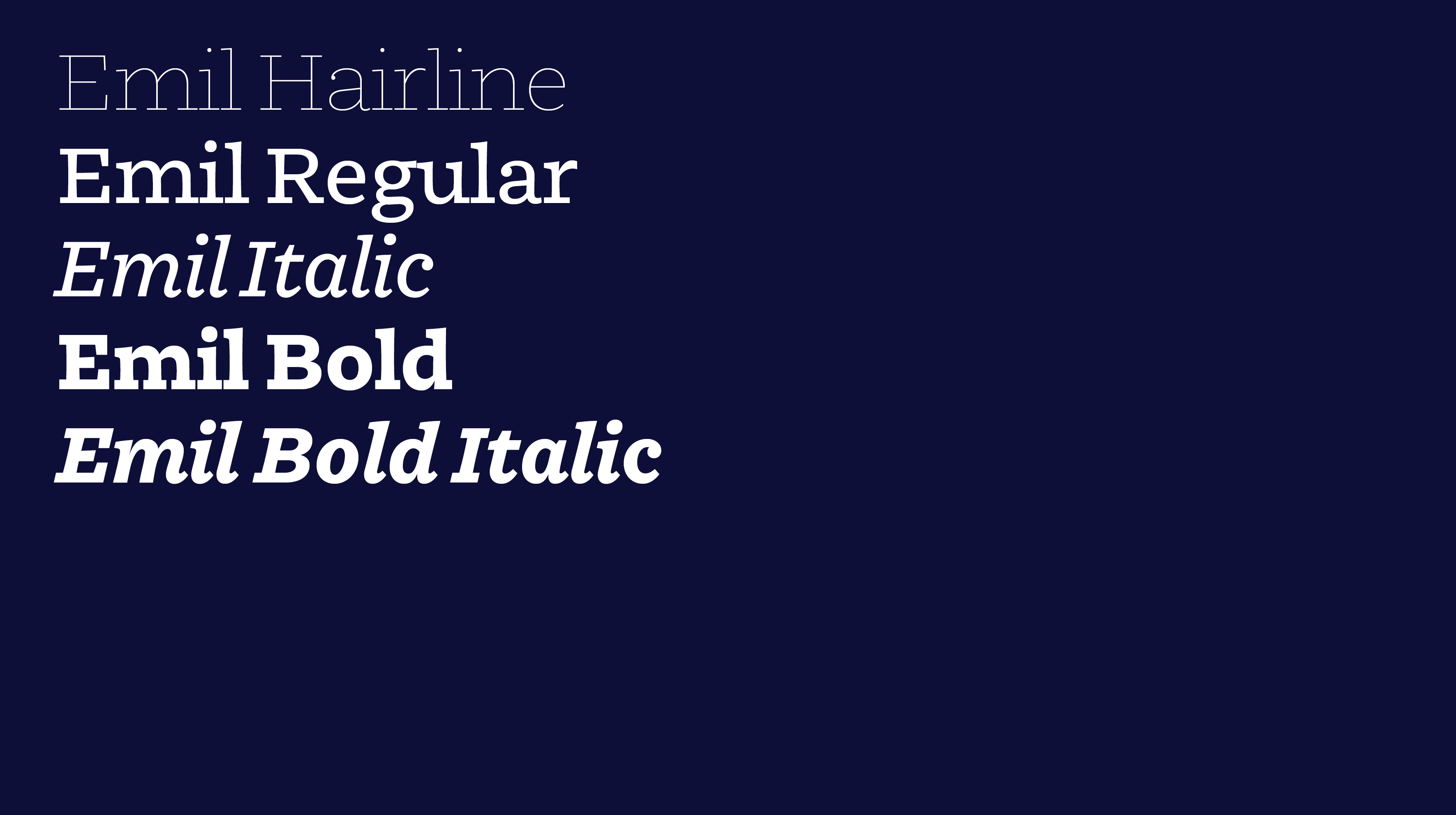
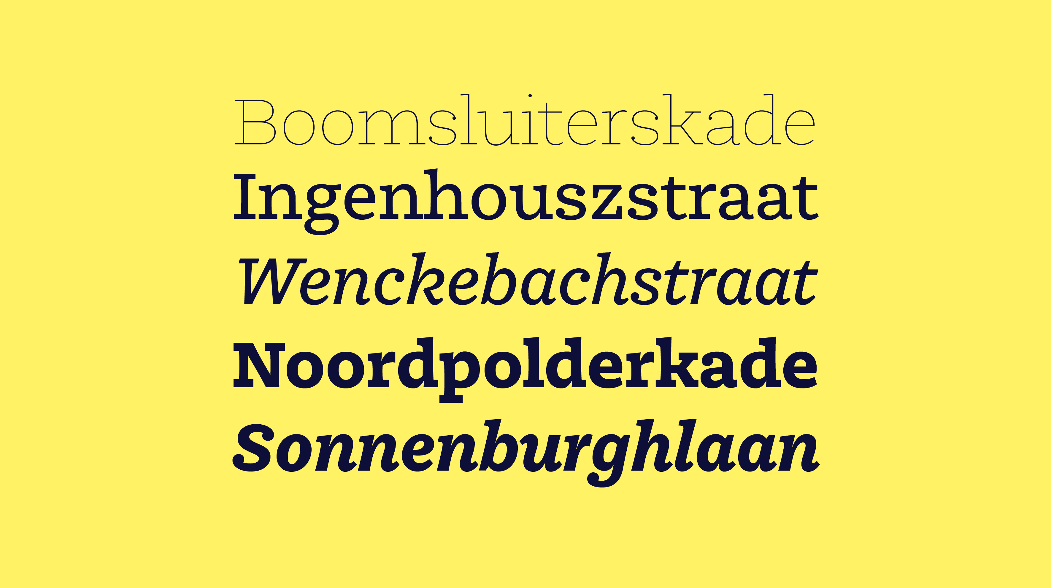
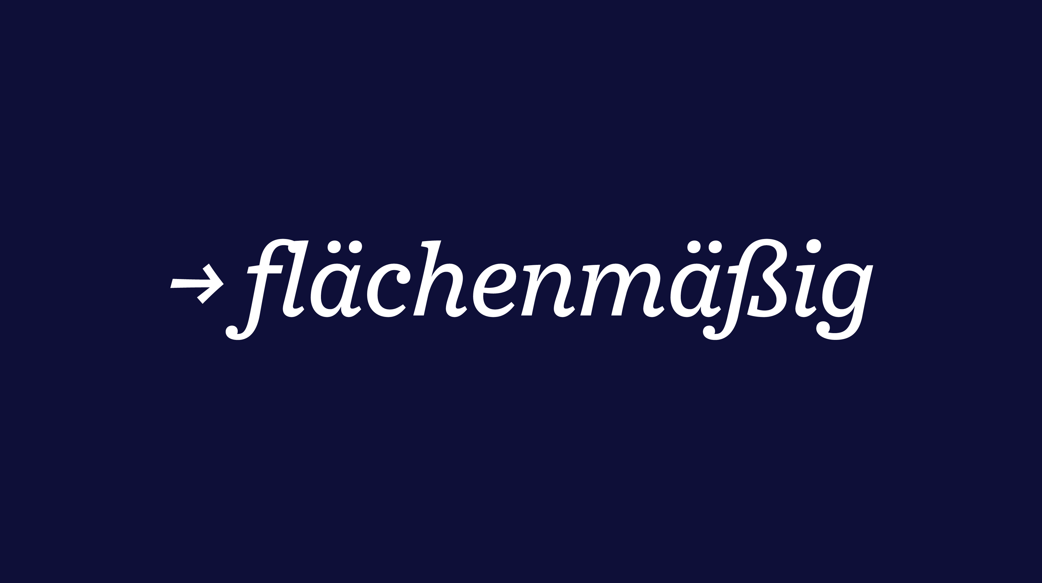
Halfway between a text typeface and a slab, Emil also draws influence from typewriter aesthetics. Shaped with concave stems and slight contrast, it also features squarish proportions contributing to a smooth and friendly read. While appearing strong and chunky in bold weight, and allowing for a softer tone in italics. Emil is comprised of 5 styles. Specifically built for body text, the Regular, Italic and Bold can also easily be used at larger sizes or paired with the Hairline – making it enjoyable in books, magazines, or office related documents.
Type and Media Master project, 2015
Designed in the Hague, the Netherlands
Designed in the Hague, the Netherlands