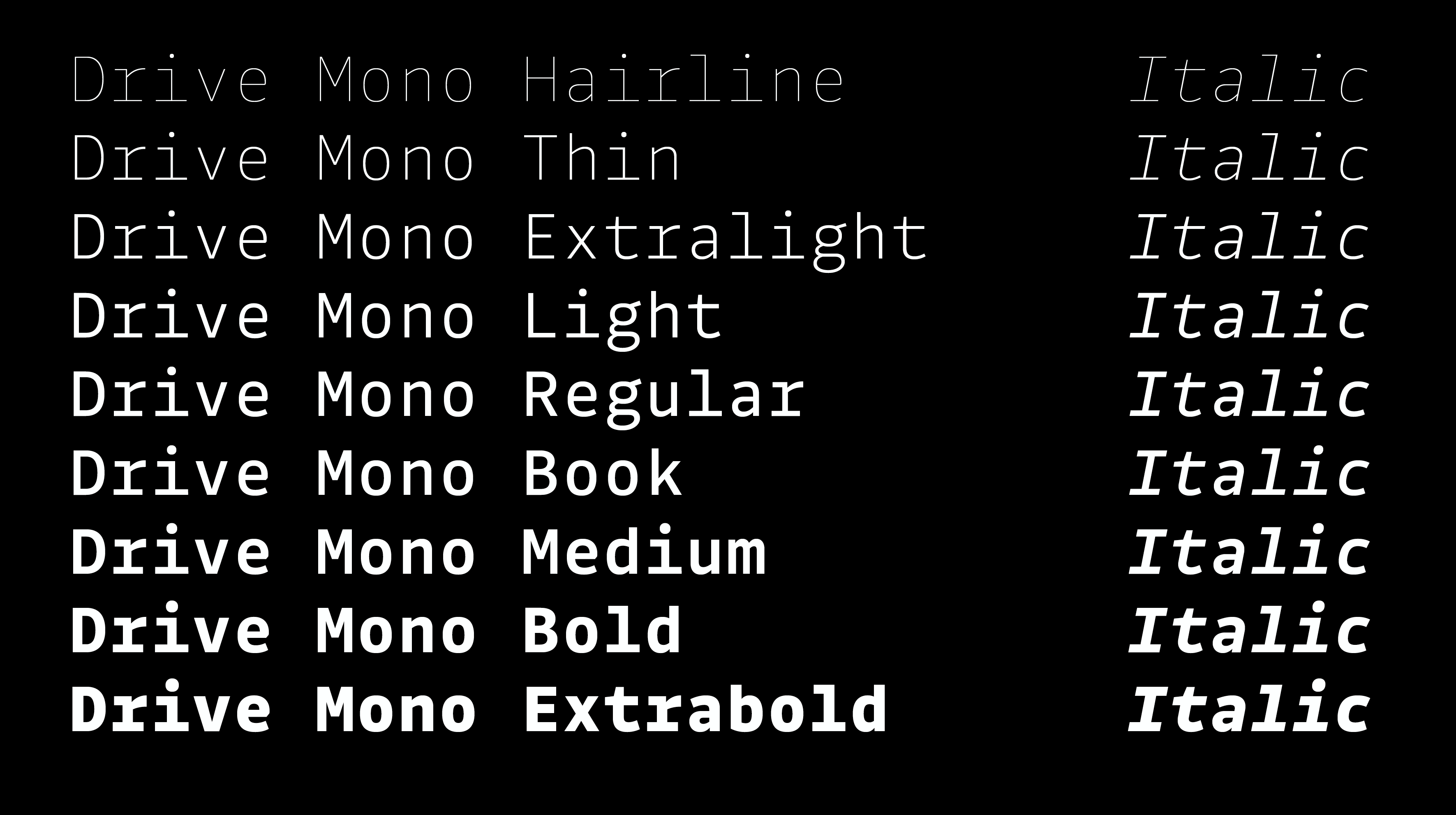
While data in tables is often easier to digest with monospaced fonts, it shouldn’t have to be set in difficult-to-read text, with letters based on 1950s typewriters. Part of BlackFoundry’s identity, Drive Mono was designed in a humanist style with open counters. Most of the characters are drawn with monolinear strokes, with equally sharp and clear letterforms. The family includes 9 weights ranging from a very thin Hairline to a heavy Extrabold – each with matching italics. Thanks to this wide number of fonts, multiple weights can be combined to increase contrast within a text. And because character width is fixed, you can switch from one font to another, without any changes in line-wrap. Drive Mono comes with 2 companions optimised for long body text : Drive and Drive Prop.
Available at Black Foundry
Art direction: Jérémie Hornus
Art direction: Jérémie Hornus